Good Morning! Last week I did a guest post for a home décor series called "pulling it together" and thought I would share the full post that I wrote for that series on my site as well. Here it is below:
----------------------------------------------------------------------------------------------------
----------------------------------------------------------------------------------------------------
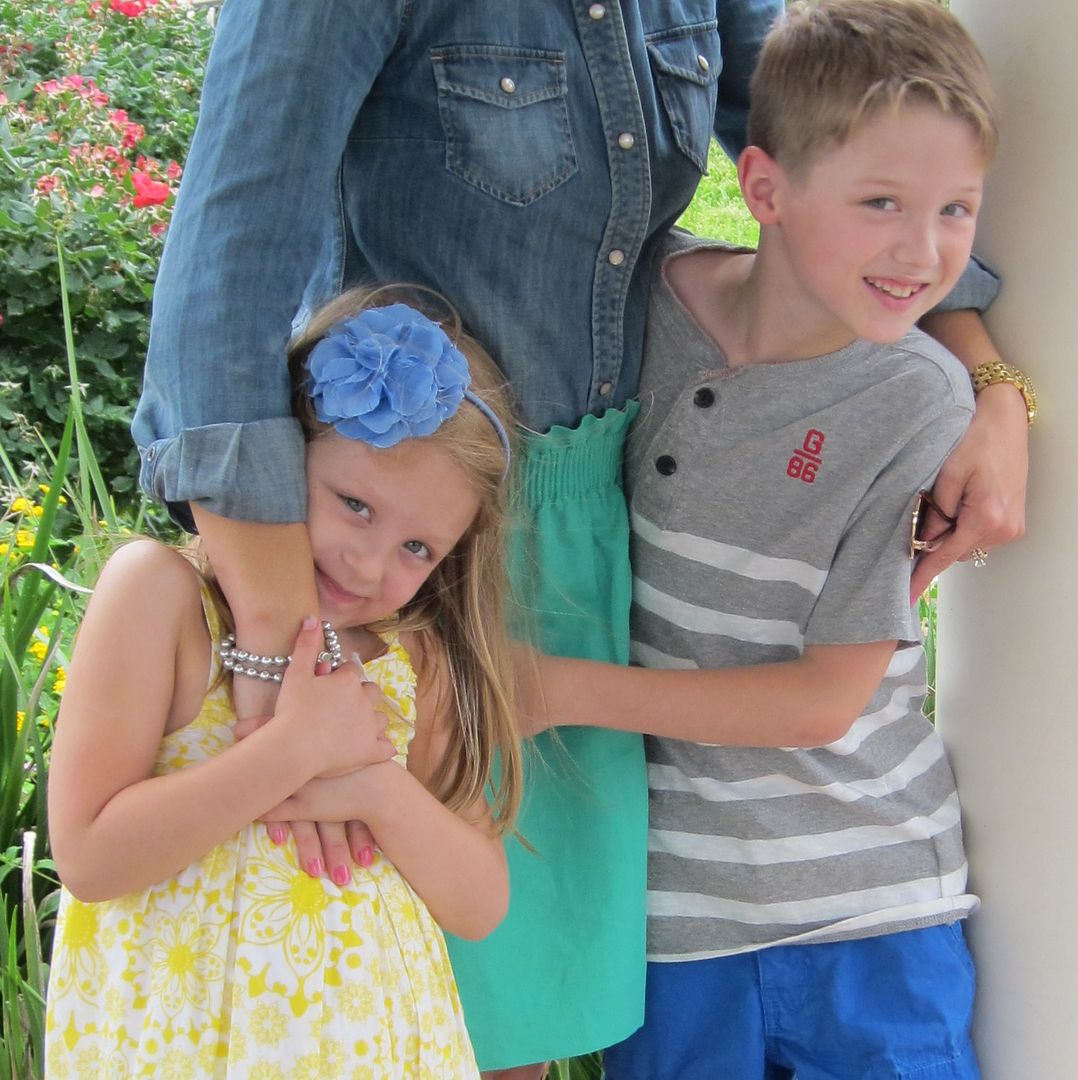
Hi there! I am so excited to be here today to share with you a fun, cheerful space in my home...my children's upstairs kids' zone. I have an eight year old boy and six year old girl and even though they have their own rooms, they are joined by a jack and jill bathroom and then both open up to a playroom. So when I thought about which room to share for this series, I felt like this would be a perfect space to show you how I "pulled it all together" for my children
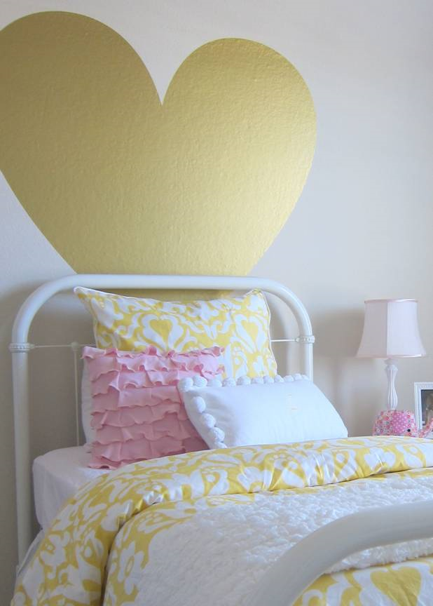
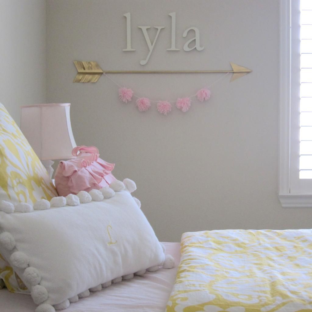
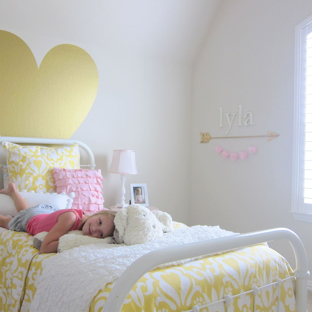
First up is my daughter Lyla's room. We changed up her room a bit at the being of this year and my main goal was to create a space that would fit her personality and that she could grow with. Previously we had LOTS of pink and I really wanted to bring in another color. I had a yellow room growing up, so I wanted to incorporate some yellow in her space :) We started with purchasing the oversized, metallic gold heart from Urban Walls and then worked on the bedding. At first, I was focused on keeping it just yellow and white, but she still had so many pink dolls and accessories, that we added some pink in as well. The pom-pom garland and gilded arrow were DIYs that added some fun touches to her room that she adores!
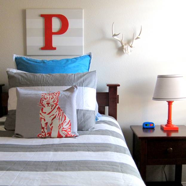
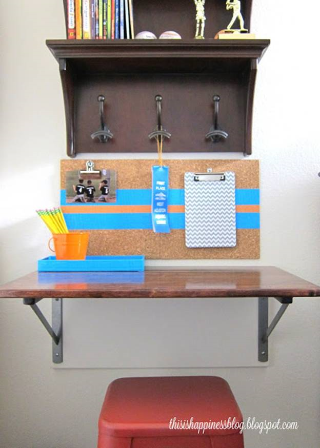
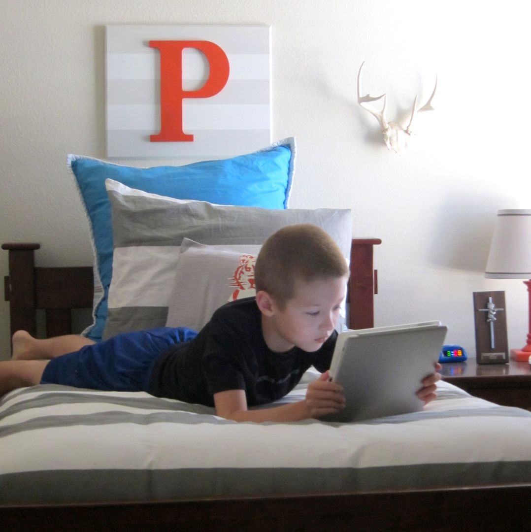
Next up is my son Preston's room. I love the gray, orange and turquoise combination for a boy's room, so I decided to go with those colors in his room. I started with purchasing this gray and white striped bedding and then added in the other colors. The white horns were my grandfather's and the wall initial and desk were DIYs. He really wanted a desk, but his room is on the smaller side, so we created this space saver desk next to his bed. It's simple, functional and most important made him happy!
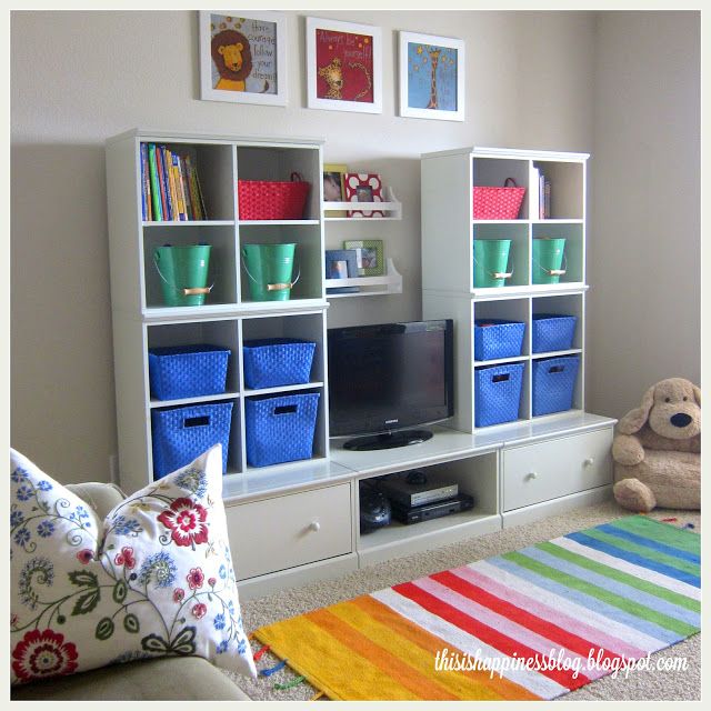
And the final area in our upstairs space is our playroom, which both of my children's rooms open up to. In here, I went with bright, bold colors and lots of cubbies for toy storage. This room is rather large and gets lots of use. I love the end result with this space. It's comfortable, functional and organized which makes clean up a lot easier :)
XO,
Becky




The children's rooms are so pretty and look like they reflect each child perfectly. I loved having you as my feature guest. I love being able to share some of my favorite bloggers.
ReplyDeleteThanks so much Marty! It was an honor :)
DeleteBeautiful rooms, I love how you pulled it all together, it flows perfectly!
ReplyDeleteLove all of it, you did a great job!!
ReplyDelete